Weekly planner layouts
Eight shapes of week. The choice is mostly about whether your week is made of appointments, of tasks, or of longer notes, and how much you write per day.
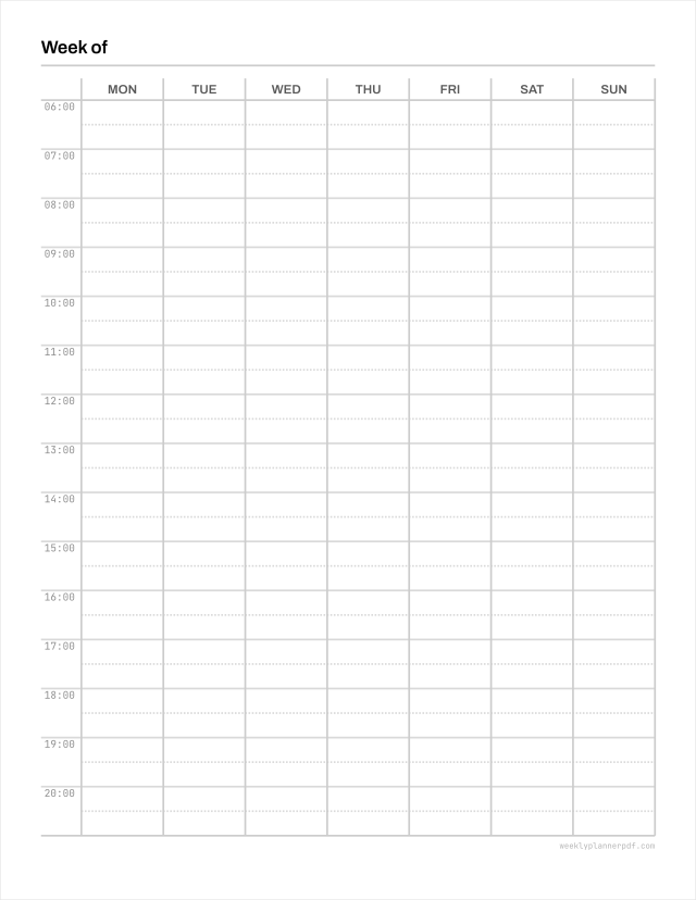
Hourly weekly planner
Seven day columns against an hour rail, so you can see where the week actually goes.
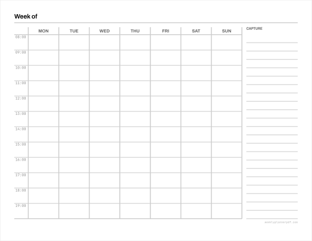
Weekly time blocking template
An hour grid with a full-height capture column beside it.
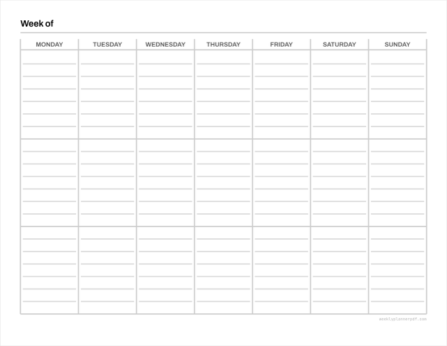
Vertical weekly planner
Days as columns, three boxes each for morning, afternoon and evening.
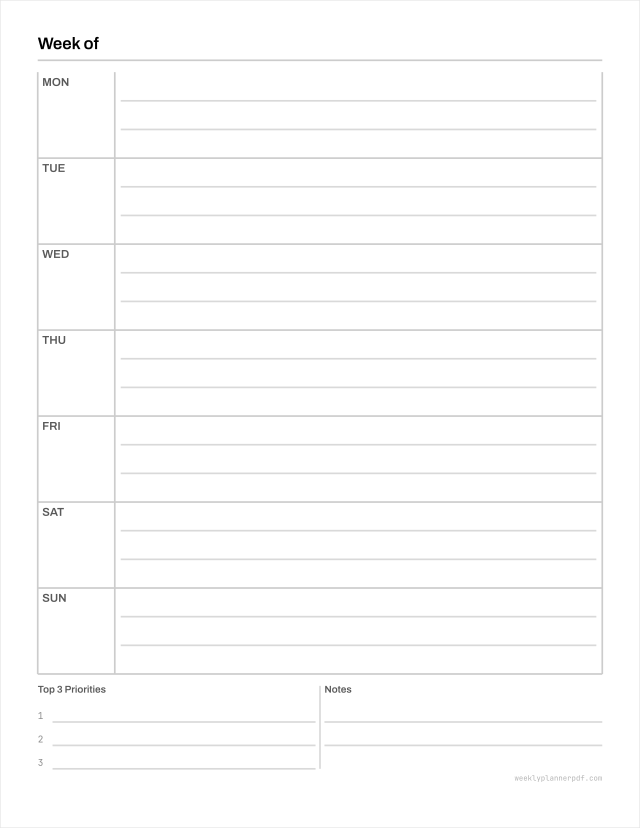
Horizontal weekly planner
Days as rows, each one running the full width of the page.
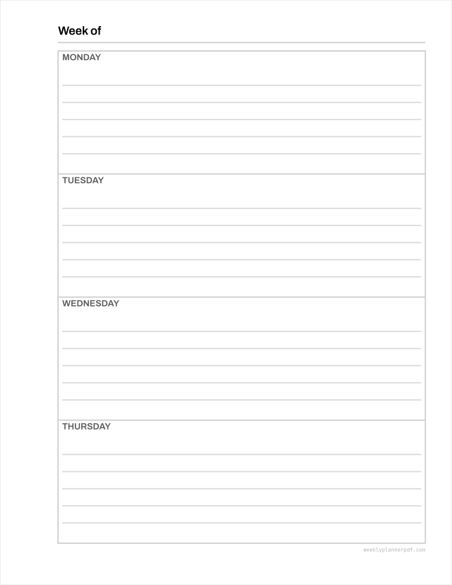
Two page weekly planner
The week across a facing spread, which is the only way to get six or seven writing lines a day.
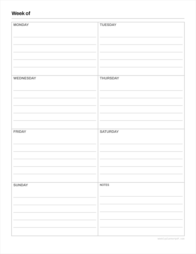
One page weekly planner
Seven day boxes and a notes panel on one sheet.
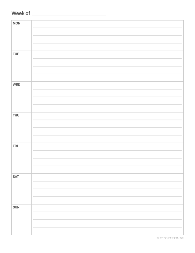
Blank weekly planner
No dates, no hour column, no printed section headings.
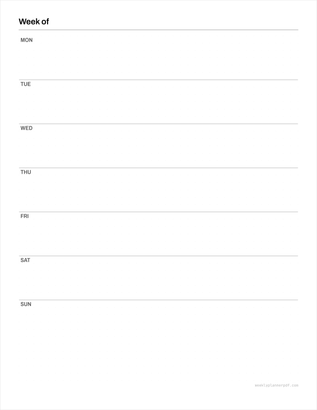
Bullet journal weekly spread
A 5mm dot grid with the lightest possible day structure.
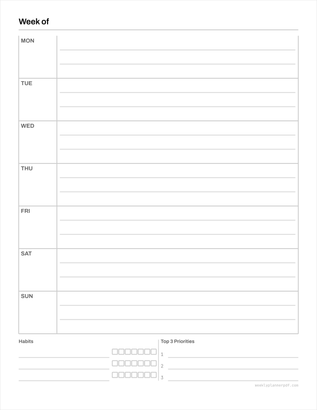
Weekly planner with habit tracker
The weekly grid with a habit row block attached, so the thing you are tracking sits on the same sheet as the week it happens in.
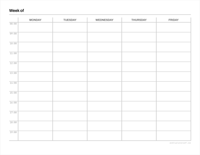
Weekly schedule template
A schedule rather than a planner: fixed recurring commitments laid on an hour grid, five days or seven, for rotas, classes and anything that repeats.
How to choose
The honest way to pick is by writing volume, because that is what the geometry actually decides. A vertical column gives you roughly 38 mm of width, which is six to eight handwritten characters per line. A horizontal row on portrait Letter gives you about 165 mm, which is a whole sentence. Neither is better; they suit different handwriting habits.
If your week is a series of times rather than a list of tasks, the hourly grid is the one that will change how the week feels, because it gives the day a physical size that a list cannot.
If you need six or seven writing lines a day, no single sheet will do it at any size we offer. That needs about 336 mm of vertical run across the week, so it has to be a two-page spread. We would rather say that than imply otherwise.
What every layout has in common
Writing space is allocated before anything else is placed. Labels, notes panels and side rails take what is left, and when there is not enough left they are dropped rather than shrinking the grid. That one rule is why these files do not feel cramped, and it is the opposite of how most planner templates are built.
Every file is available in Letter, A4, A5 and Half Letter where the geometry allows it, at 12.7 mm margins, with rules at 20% grey rather than black so a weekly reprint does not cost a cartridge.